Appearance
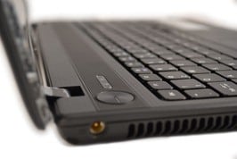
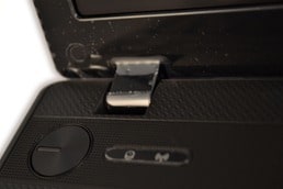
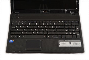
The design of the Acer Aspire 5742 is very simple and ergonomic, but there is something compelling to it. The lid cover as well as the area around the touchpad is made of a plastic material, which kinda differs from today’s aluminum cases, but the carbon looks makes it attractive. A big circle power button is placed next to the two led indicators for wi-fi and hard driver activity.
The left hindge is placed right above the indicators and it seems like it is made also from plastic, and feels a bit loose for a new notebook. We hope
Keyboard & Touchpad
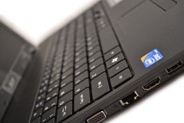
The keyboard is chiclet style, it looks pretty stylish and the feel as for my personal taste is one of the best I have tried. However this chiclet keyboard is not designed like most of it’s type, The keys are far from one another, but there is also space below which can be a problem for cleaning later, so be sure to keep it tidy.
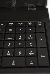
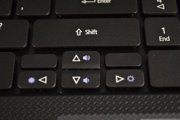
The numpad is also in full size, nothing is compromised. The arrow keys are a bit small like for childish fingers, and are placed right under the Shift key. I like the idea of placing the volume and brightness control on the arrow rather than on the F# keys. It feels more natural to do this with the arrows, nice touch.
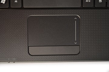
The touchpad is a little smaller than expected, but it does feel smooth and easy to maneuver. Fingers won’t get stuck when pushing a little harder than usual against the surface. Also because of the summer time, I can tell you that it doesn’t get stuck even with a little sweaty finger 
