HP Probook 4520s Opened

HP Probook 4520s Review

Appearance


When I first saw the HP Probook 4520s in it’s original black/sophisticated caviar(as HP calls it with it’s fancy name), I thought to myself “now we are talking business”! It really looks pro as the name implies and has great improvements over the previous HP Probook 4510s although at first it does look pretty much the same. The lid is replaced with aluminum, the keyboard is spill-resistant, and it feels much firmer overall. Now the black one did look a bit more of a manly notebook, but when I saw it in this champagne color I knew that this is much more mainstream, fancy girls actually bought these even more than men. The first thing you notice is the brushed aluminum on the lid. Looks very stylish yet professional.

HP Probook 4520s Lid HP Probook 4520s Power Button 4

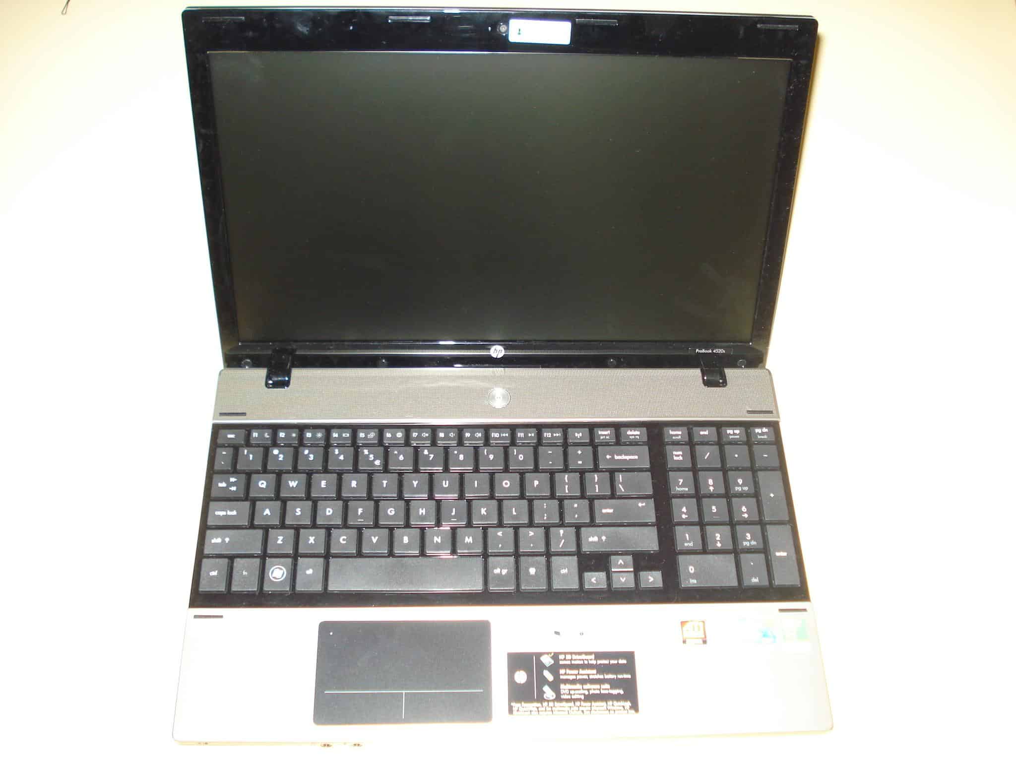
As soon as you open the HP Probook 4520s up, you can see the screen is surrounded with plastic black material, and the whole keyboard also lays on black plastic material. Above the keyboard is a silver aluminum mesh with the power button in the middle, which lightens up when turned on. The palm rest area below the keyboard is also silver and aluminum, with the touchpad again being big and black aligned at the center at the keyboard. The HP logo is also on the bottom center of the screen part, and with little minimalistic font the model Probook 4520s is written on the left side.


HP Probook 4520s Webcam

HP Probook 4520s Front Led

HP Probook 4520s Hindges 3 HP Probook 4520s Bottom


Keyboard & Touchpad

HP Probook 4520s Keyboard Touchpad Chiclet is the word, invented years ago, but really in trend right now. With large sharp cube keys and big gap between them it fits the design of the notebook perfectly. It’s a standard US layout without anything missing, we have the fn key included again as in all notebooks these days. The fn key in combination with the f1, f2.. keys does  the standard operations like: sleep, brightness control, volume etc.. and the smart move, which I do respect very much, is moving the wifi control on/off button separately without having to use it in combination with the fn button. It’s right there next to f12 with an orange led on the side of it when on.

HP Probook 4520s Touchpad A really big black area, again with the minimalistic design, represents the touchpad of the HP Probook 4520s. The buttons are separated with one thin T line in the middle. Well to be frank, this has to be the part which I love the least. The buttons of the touchpad aren’t seperated phisically and the purpose for that is, because they are also part of the touchable surface. I found this pretty annoying at times, especially when you have to click on a small area. This does make the touchpad quite big, but it’s not practical at all.


3 thoughts on “HP Probook 4520s Review”

  1. Hi blogger, i must say you have very interesting posts here.
    Your website should go viral. You need initial traffic
    boost only.

Leave a Comment

Your email address will not be published. Required fields are marked *

Scroll to Top